Color
Beyond our logo, color is the most recognizable aspect of our brand identity. Colors were selected that reflect our bold, diverse community and given names that reflect their inspiration.
Color Is More Than an Aesthetic Choice
Using color appropriately is one of the easiest ways to make sure our materials reflect a cohesive Rackham image or visual story.
Colors are also the building blocks of accessibility. After a long exploration, the standardized Rackham color palette was created to achieve good contrast in the interest of legibility across all channels and media.
Primary Palette: Signature Colors
Our signature color palette of Michigan maize and blue creates a powerful differentiator for our brand. Using this palette appropriately and consistently creates an additional layer of distinction.
Signature colors may be used extensively both for large areas of color and as accent colors.
| U-M Maize PANTONE: 7406 CMYK: C0, M18, Y100, K0 HEX: #ffcbo5 |
U-M Blue PANTONE: 282 CMYK: C100, M60, Y0, K60 HEX: #00274c |
Secondary Palette: Supporting Colors
The colors in our supporting palette were chosen to complement our primary palette of maize and blue, providing additional range to the brand experience. They work well as accent colors or as backgrounds behind typography or graphics, but should never replace the primary palette as the main color(s) of a design.
| Tappan Red PANTONE: 484 CMYK: C8, M92, Y100, K33 HEX: #9a3324 |
Ross Orange PANTONE: 1595 CMYK: C0, M71, Y100, K3 HEX: #d86018 |
| Wave Field Green PANTONE: 398 CMYK: C14, M6, Y100, K24 HEX: #a5a508 |
Rackham Roof Green PANTONE: 5565 CMYK: C44, M12, Y34, K24 HEX: #75988d |
| Taubman Teal PANTONE: 326 CMYK: C81, M0, Y39, K0 HEX: #00b2a9 |
Arboretum Blue PANTONE: 660 CMYK: C88, M50, Y0, K0 HEX: #2f65a7 |
| A2 Amethyst PANTONE: 2603 CMYK: C72, M99, Y0, K3 HEX: #702082 |
Matthaei Violet PANTONE: 668 CMYK: C70, M77, Y7, K23 HEX: #575294 |
| UMMA Tan PANTONE: 7502 CMYK: C6, M14, Y39, K8 HEX: #cfc096 |
Burton Tower Beige PANTONE: 451 CMYK: C21, M15, Y54, K31 HEX: #9b9a6d |
| Angell Hall Ash PANTONE: PANTONE Warm Gray 6 CMYK: C14, M19, Y21, K39 HEX: #989c97 |
Law Quad Stone PANTONE: PANTONE Warm Gray 11 CMYK: C26, M36, Y38, K68 HEX: #80764b |
| Diag M Metallic PANTONE: 872 |
Puma Black PANTONE: PANTONE Black 6 CMYK: C100, M79, Y44, K93 HEX: #131516 |
Sections
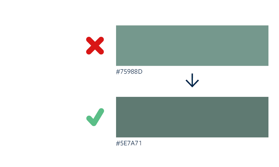
Accessible Rackham Green
U-M Rackham green does not meet specified accessibility criteria. It has been darkened by 20% to meet AA standard for contrast ratio as stipulated in the Web Content Accessibility Guidelines (WCAG) 2.0. U-M Rackham Green can still be used in decorative contexts.
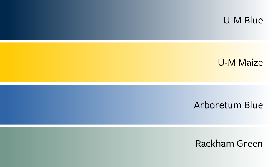
Gradients
A gradient can be used to enliven fields of color. If the gradient is used strictly as a background—for instance, under an overlay box—you can use the complete color range. If you are overprinting the gradient with type, you need to make sure the resulting contrast ratio meets accessibility standards.
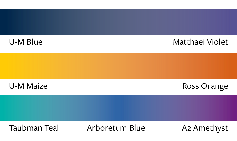
Gradients: Combining Colors
Gradients can combine more than one color.
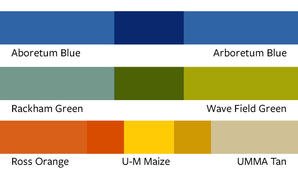
Transparency
Using tints of the colors can create a dynamic effect. It also adds visual depth and flexibility to show information hierarchy. When using text or logos on imagery, adding a color transparency can help with legibility and emphasize ideas.
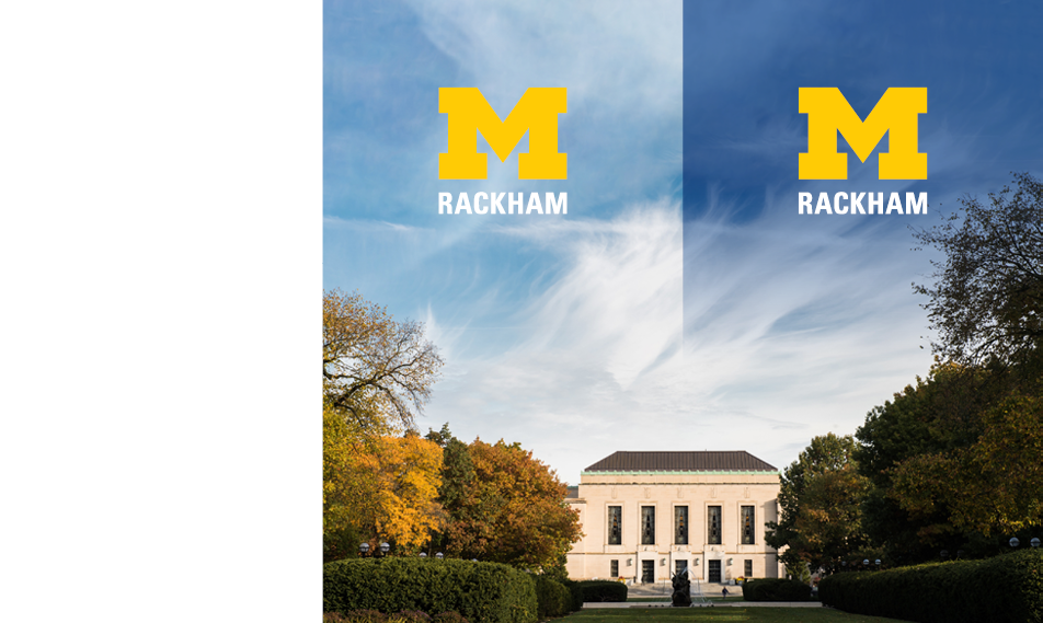
Gradients and Transparency Overlay for Accessibility
Overlaying colors under text, icons, or logos will increase the legibility.
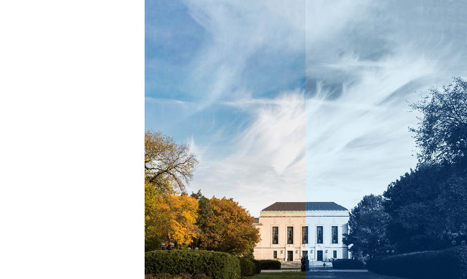
Duotone
When imagery is from different sources a duotone effect can create a unified look.
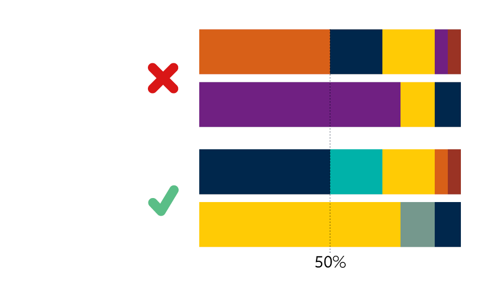
Color Ratio
Primary colors should always be the dominant color. Use 50% or more of any primary color for your project palette.
