Typography
Typography is a powerful tool. When used effectively, the right font commands attention, elicits emotions, and above all, creates a voice. It’s why typography is such an essential component of our brand’s visual identity.
Communications from Rackham are most effective when the words are consistent in both content and appearance.
How We Choose Our Typefaces
Accessibility
For users with a visual impairment, reading disability, or learning disability, certain letters or combinations of letters can be confusing due to the lack of defining characteristics. Because of this, it is important to choose fonts that have strong and unique characters.
Legibility
Legibility refers to the design of the typeface—the width of the strokes, whether or not it has serifs, the presence of novel type design elements, etc. It is easy to tell one letterform from another in a legible typeface.
Readability
How our typeface is set, combined with the basic legibility of the typeface, yields a certain level of readability. In most cases, communication comes before style—form follows function—so readability is resolved first.
The Freight font super family is actually four families in one: the Freight Sans family, the Freight Text family, the Freight Big family and the Freight Micro family.
Sections
- Introduction
- Accessibility
- Typography
- Color
- Logos
- Style Guide

Sans Serif Typeface
The primary sans serif typeface is Freight Sans. It’s clean, modern, warm, flexible, and easy to read. With its human design aesthetic, Freight Sans is perfect for a wide range of visual communications, and it’s suitable for text or display use.
Weights
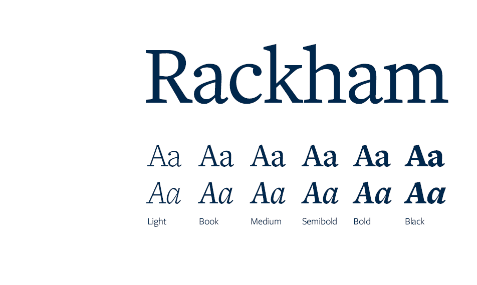
Freight Sans has 6 weights: Light, Book, Medium, Semibold, Bold, and Black. It has matching italics for all weights.

Serif Typeface
The primary serif typeface is Freight Text. Its appearance lends a formal style, while its italics give our quotations a personal feeling. Its unique form has plenty of personality for
headlines while remaining practical for long body copy.
Weights
Freight Text has 6 weights: Light, Book, Medium, Semibold, Bold, and Black. It has matching italics for all weights.

Alternatives
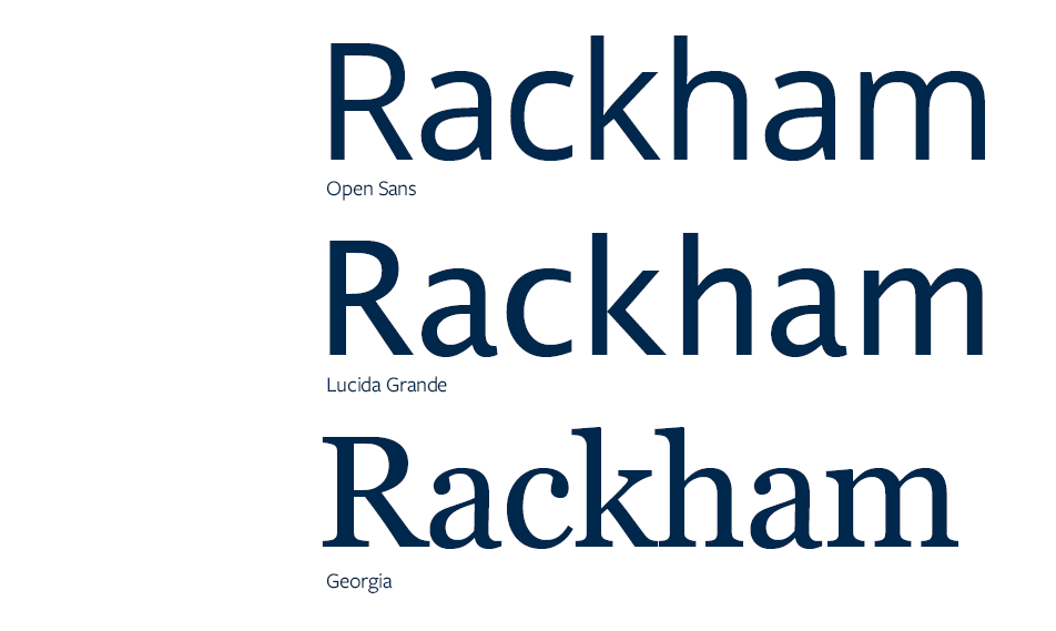
Freight Sans and Freight Text are the preferred fonts whenever possible for the Rackham brand, but if it is unavailable the alternate fonts Lucida Sans/Grande and Georgia can be used instead. Lucida Sans/Grande and Georgia are available across all platforms and provide a consistent option for the brand as a backup. Alternatively, Open Sans is a free web alternative to Freight Sans.
Sans Serif
Web Font: Open Sans
Microsoft Word/Google Docs and Microsoft Powerpoint/Google Slides: Lucida Sans/Grande
Serif
Web Font: Georgia, Garamond
Microsoft Word/Google Docs and Microsoft Powerpoint/Google Slides: Georgia, Garamond

Hierarchy
Use headings to communicate hierarchy. Ensure heading styles differ from paragraph text by some combination of size, weight, face, or color. This ensures they’re distinct from paragraph text but are related to each other with some consistency, which helps with scanning.

Typeface or Font?
Typeface refers to the family, or what you see, and font refers to what you use.
